
Chrome — Lulu! We need to talk. Will you please come out of that box, now?
Lulu — Well, I'm busy.
Chrome — Hey what's your obsession with that box, huh?!
Lulu —
Chrome — Okay, I was gonna talk about boxes in CSS. You know, I give boxes to all the elements in HTML document.
Lulu — What! Where did you find so many boxes?
Chrome — Please come out and I'll tell you.
Lulu — I'm coming, coming!
Everything in CSS has a box around it. If you want to create complex layouts, the understanding of these boxes is essential.
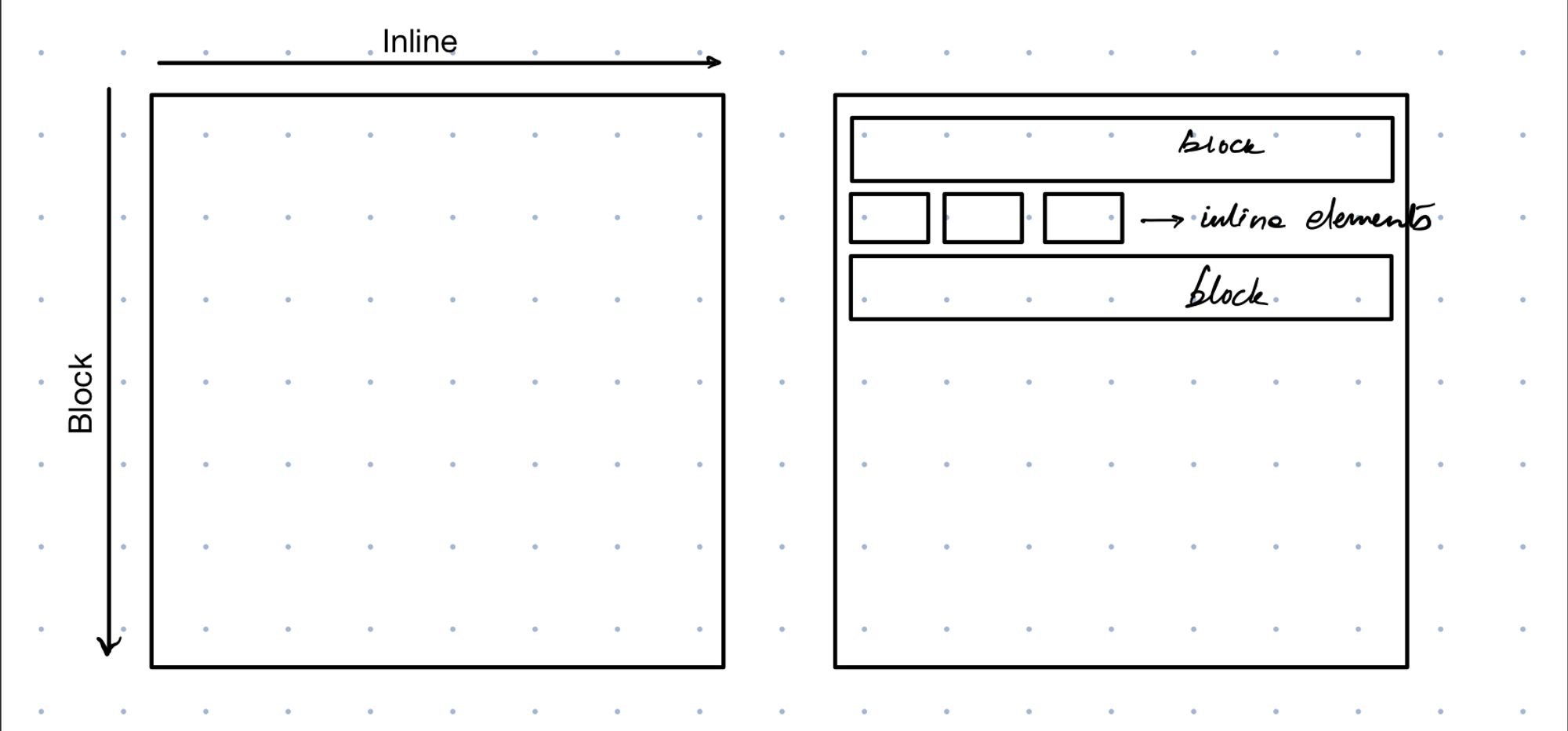
Let’s start simple. Broadly, there are only two types of boxes – block and inline. Block boxes take up full width of their containers and always break onto new line. Inline boxes, on the contrary, will take only as much space as their content. And will never break onto new line.
Normal Flow
CSS layout mode or layout, as MDN describes, "is an algorithm that determines the position and size of boxes based on the way they interact with their sibling and ancestor boxes". Which in turn is controlled by the 'display' property.
Without any additional instruction (i.e. without assigning other values to 'display' property), the layout created by block and inline elements is the default way how elements fall on a page. Hence it’s called normal flow or normal document flow or document flow.
(There are other layout types such as float layout, table layout, grid layout and so on. But we don’t need to know more about them as of now.)
Lulu — You mean, there are only block and inline elements on a page?
Chrome — If you don't play with the 'display' property, yes. It has always been like that since inception of web.
CSS Box Model
CSS box model defines how wide and tall will be the elements on the page.
I want you to understand this - The box model applies fully only to block boxes; and partially to inline boxes.
Parts of the Box
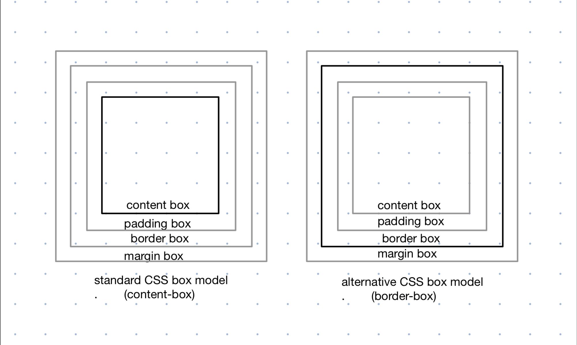
Before we discuss anything else, let's understand what a box is made up of -
- It starts with a content-box which contains the actual content i.e., the child elements, text, images.
- The content-box is surrounded by padding to give the padding-box.
- The padding-box is wrapped inside the border to construct the border-box. This completes our box.
Remember, there's a margin-box wrapping all 3 areas but that's not the part of the box, even though it determines how near or far are the neighbouring elements.
Each of these areas can have a size of 0 or more. Only margins are allowed to have negative values as well.
Standard CSS Box Model (content-box)
In the standard CSS box model, the height and width that you assign to an element, becomes the dimension of the content-box. The total space taken up by element is then given by
Horizontal space = left-margin + left-border-width + left-padding + width + right-padding + right-border-width + right-margin
Vertical space = top-margin + top-border-width + top-padding + height + bottom-padding + bottom-border-width + bottom-margin
It's activated by (box-sizing: content-box;) which is by default.
Alternative CSS Box Model (border-box)
In the alternative CSS box model, the height and width that you assign to an element, becomes the dimension of the visible box on the page. The total space available for content-box is then given by
Content box width = width - left-border-width - left-padding - right-padding - right-border-width
Content box height = height - top-border-width - top-padding - bottom-padding - bottom-border-width
It's activated by (box-sizing: border-box;).
Box Model and Inline boxes
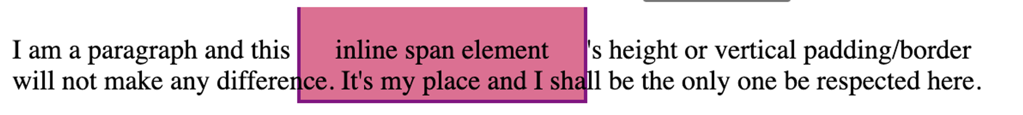
Remember box model applies only partially to inline boxes? That happens because inline boxes
- ignore any height and width assigned to the element.
- respect any vertical height, padding or border assigned, but that doesn’t change how neighbouring boxes interact with it.
There's a special value for 'display' property that helps us deal with this weird behaviour of inline boxes - 'inline-block'. Giving that to an element takes away the above mentioned problems while still behaving as an inline box. Hence, you find a major use of this property in designing navigation bars and lists.
Lulu — But how do you arrange so many boxes on the page? Don't you get confused?
Chrome — You remember User Agent? He helps. With something called Visual Formatting Model.
Visual Formatting Model (VFM)
It describes how User Agent processes document (i.e., HTML elements on page) and display it on a visual media (screen, page, etc.). We can understand the model by discussing few critical parts of it.
Viewport
A viewport is the area on screen (example: browser window) on which the webpages are rendered. User Agents can change the layout whenever the viewport is resized.
Box Generation
It is a part of VFM that takes the document and creates boxes. The box type (which is controlled by 'display' property) affects the visual formatting.
While rendering an HTML document on to canvas, CSS generates 0 or more boxes for each element.
- Principle Box
It is the box that contains descendant boxes. It's also involved in the positioning scheme.
If the 'display' is 'none', 0 boxes are created (and therefore nothing is rendered). However, if one or more boxes are created then one of them is principal box.
For example,
If 'display' is 'block', one principal box is created.
If 'display' is 'list-item', one principal box is created and one additional child marker box.
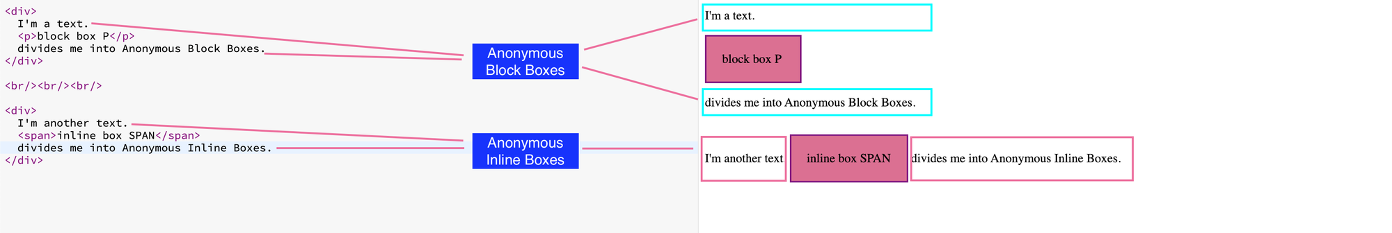
- Anonymous Box
It is created when there is no HTML element to use for the box. Anonymous boxes cannot be targeted using a CSS selector and they inherit styles from their ancestor boxes.
Anonymous boxes are usually created for text runs inside HTML elements. If text has a block element separating it, the text is wrapped inside an anonymous block box. If text is separated by an inline element, the text is wrapped inside anonymous inline box.
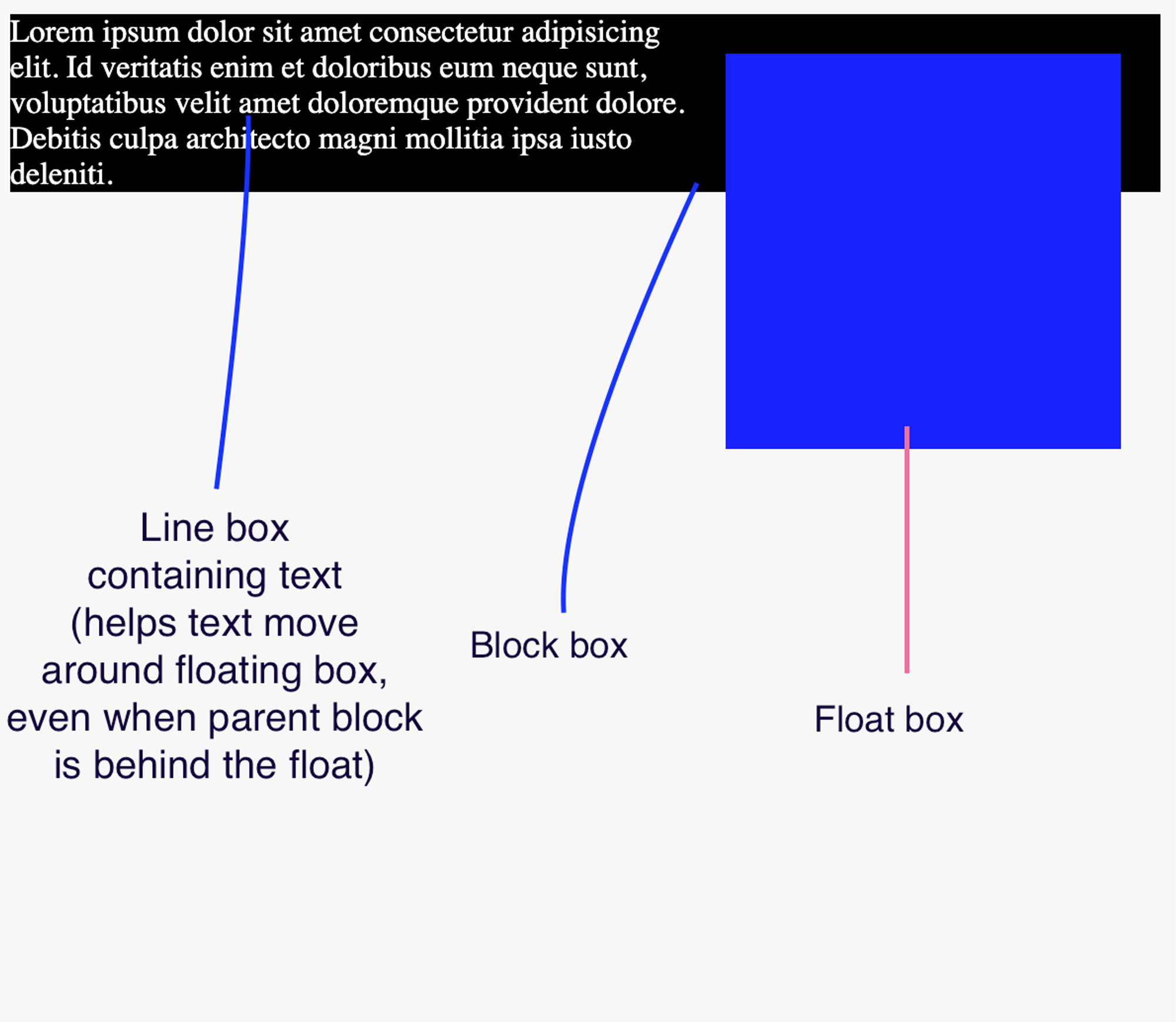
- Line Box Line boxes are the boxes that wrap each line of text. They are therefore very useful for browser to make the text flow around float elements.
In-flow & Out-of-flow elements
To understand in-flow and out-of-flow, we need to have an understanding of positioning scheme. It's quite straightforward -
- Normal Flow (that you already know now) - contains block, inline and relative/sticky block & inline boxes.
- Float - in float layout, a box is placed in normal flow, then taken out and positioned to left or to right.
- Absolute (includes fixed position)- the box is placed in normal flow, removed entirely from there and assigned a position with respect to containing block (in case of fixed position, it is the viewport).
Now, an element is out-of-flow if it's float, absolute, root (like '<html>'). Else, it's in-flow.
Understanding 'display' for box
At a deeper level, the 'display' property will always have 2 values - outer display and inner display.
The outer display tells how an element interacts with its siblings or ancestors. The inner display on other hand, sets rules for the behaviour of its descendants.
The 'display' property value decides both outer and inner display values.
- The outer display will always either be block or inline. For example: 'inline' & 'inline-block' give an outer display of 'inline'. 'block', 'flex', 'grid', etc. all give an outer display of 'block'.
- The inner display can be different depending on the layout. For example: 'block' & 'inline' will give inner display of 'flow'. 'flex' & 'grid' will give inner display of 'flex' & 'grid' respectively. and so on.
Lulu — Woah! That's so much about boxes. And you were asking ME about obsession with boxes?
Chrome — Well, a browser has gotta do what a browser has gotta do!
Lulu — Hmm. More about boxes?
Chrome — Yea. But maybe some other day.