
Lulu — Hey, will you tell me about "pixel-perfect" design?
Chrome — Who told you about that?
Lulu — You know there's a designer who lives just 'round the corner? His cat.
Chrome — Sure, I can understand. You know, pixel-perfect and all is nice but a good web-app is one that serves all users really well. One that's responsive. And that cannot be done with just pixels. You need relative units to do that.
Lulu — What?! We have other units of measure in CSS?
Chrome — Oh yes Lulu. But sadly relative units are intimidating for most developers. But come, we'll sort it out for you. It's short, sweet.
Absolute Units
We all know about the most used unit in CSS - pixel (px).
It's an absolute unit. That means it's always the same. 3px is always 3px. There are more absolute units available for use in CSS –
- Inches (in), centimetre (cm), millimetre (mm)
- Point (pt) — Smallest unit of measure in typography.
- Pica (pc) — Another typography unit of measure, almost 1/6 of an inch.
Let's do some math here –
1 in = 2.54 cm
= 25.4 mm
= 6 pc = 72 pt = 96 px
Lulu — How do we know which absolute value to use?
Chrome — When you're writing in absolute units, just use px as you do. That's what developers use. However, pt is extensively used by designers. So keep an idea of that. That'll help you when you're talking to the designer.
Relative Units
Relative values are ones which change, based on external factors such as element on which they're being applied, the size of the browser viewport, so on.
Relative values are declared using relative units. Relative values are always evaluated to an absolute value by the browser. It's called 'computed value'.
There are two most important relative units - em & rem. And some less used ones like ex, ch.
Em
'em' comes from typography where it's referred to as currently specified point size. In CSS,
1 em = font-size of current element
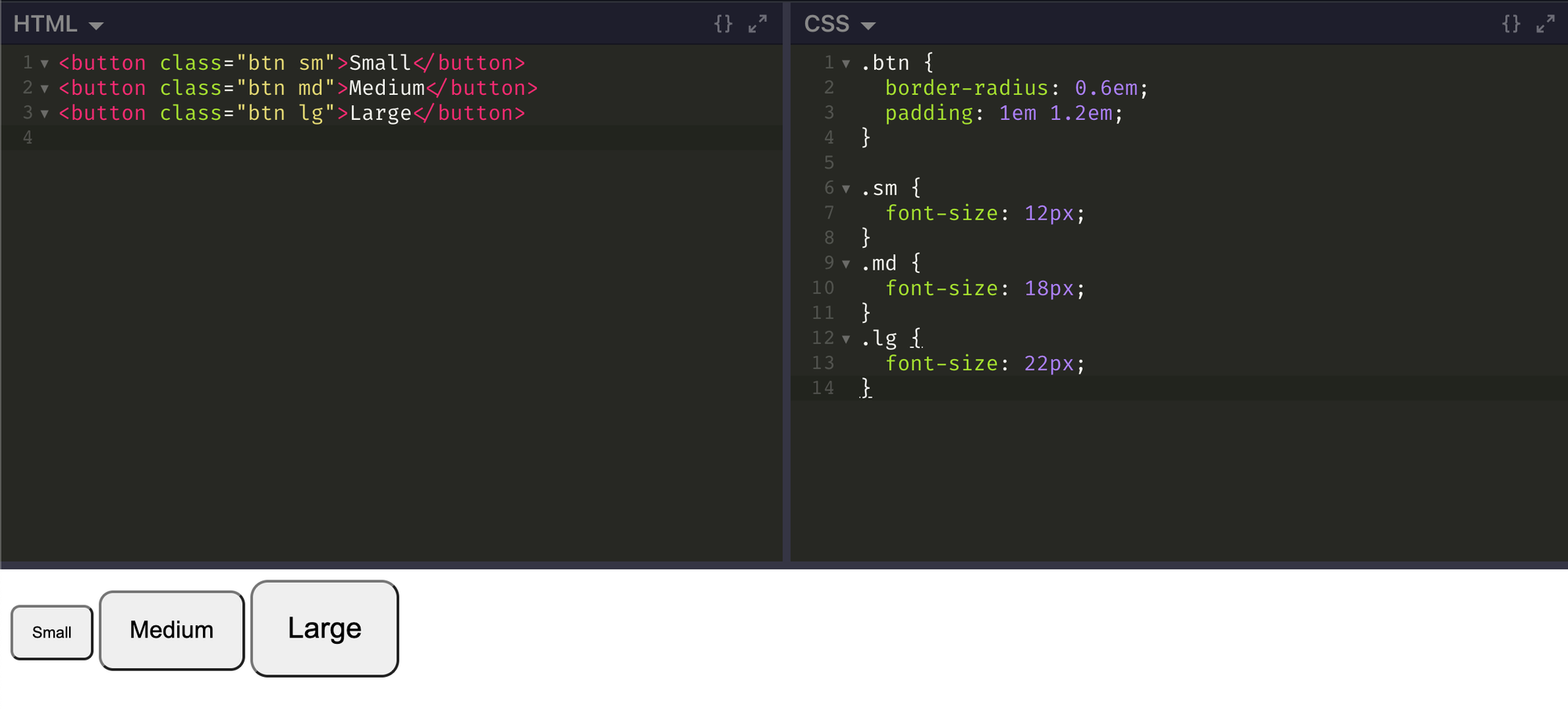
ems are very convenient and best to use with properties like height, width, padding, border-radius, etc. Basically, properties related to the box model.
For example, see how well it goes for creating different sized buttons when you just need to assign new font-size value and everything else grows in proportion.
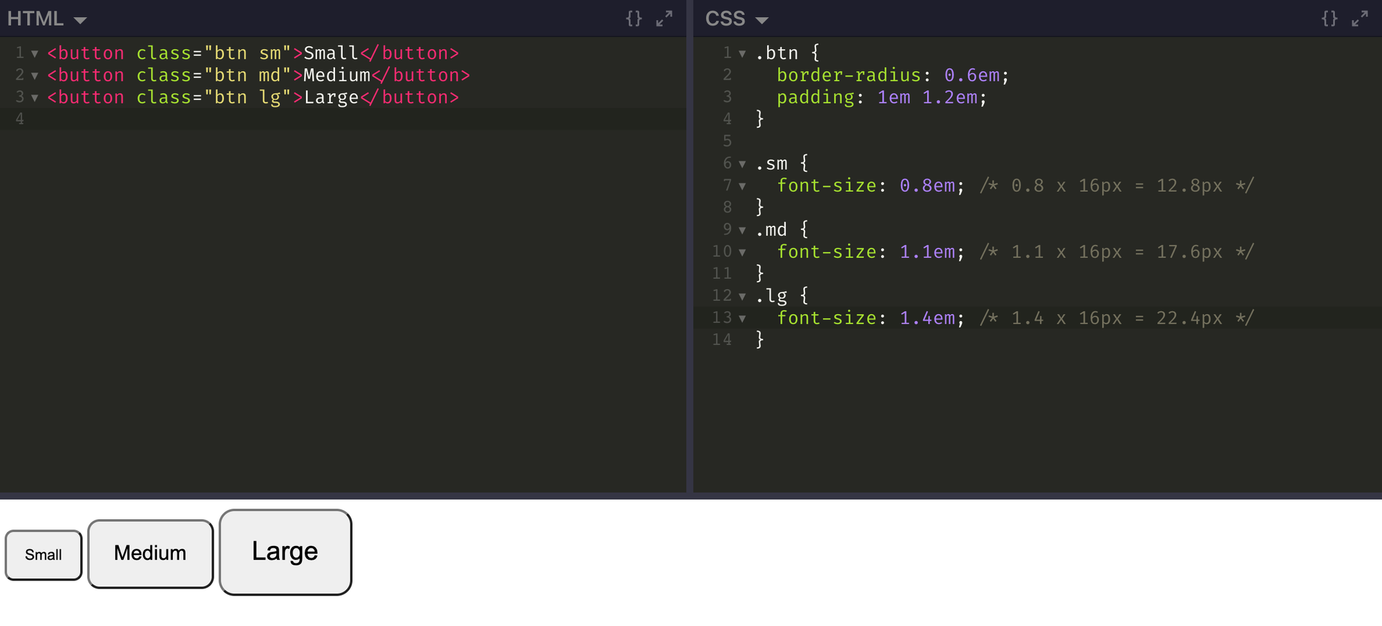
Lulu — What if font-size itself is declared in em?
Chrome — Well Lulu, in that case, the element inherits font-size in pixels from parent element and uses it to derive a computed value for it's own font-size. This computed value is used by other properties which are declared in relative units. Let's declare font-size in em in our buttons' CSS to keep things almost same.
Continuously changing font-size problem
If you ever try using em on list elements like ul or ol with a value other than '1em', you'll see that the font-size of its text continuously changes in nested lists. If you declare a font-size more than 1em, the font will continuously become larger. If the size you declare is less than 1em, it'll continuously become smaller.
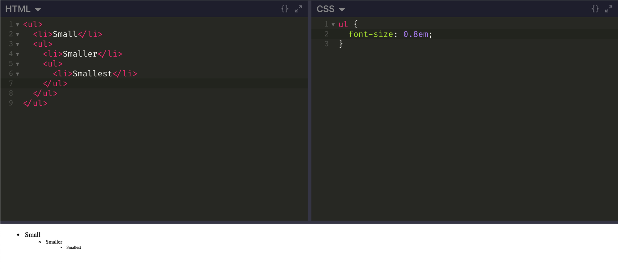
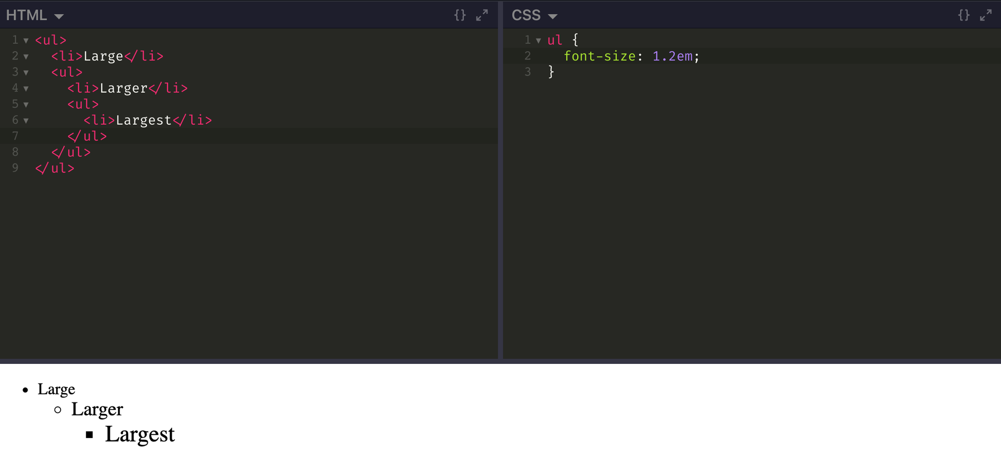
That's because each nested ul inherits a reduced or increased font-size from parent and further reduces or increases it.
Lulu — Now that's really weird. And how do we deal with that thing, huh?
Chrome — With another important relative unit! No, really, it's interesting. Just see.
Rem
'rem' is basically root em. Instead of being relative to current element, rem is relative to root element (usually 'html').
:root selector — is a special selector for root node. It's equivalent to 'html' tag selector, with specificity of class (which makes it slightly better).
You should already see now how rem can fix our 'continuously changing font-size problem'. Here's how -
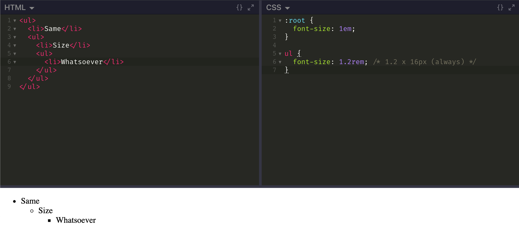
The font-size is computed by multiplying rem value with font-size of root element (and not to what it inherits).
Viewport relative units
Viewport relative units are for defining lengths relative to the browser's viewport size.
- vh — 1% of viewport height. For example, 20vh on a viewport that's 800px in height, will give you 160px.
- vw — 1% of viewport width
- vmin — 1% of the smaller dimension (vh or vw); i.e., if viewport's height is less than its width, height will be used, else width.
- vmax — 1% of the larger dimension (vh or vw); i.e., if viewport's height is larger than its width, height will be used, else width.
Viewport relative units are useful in creating full height layouts (dashboards, signin/signup pages, etc), responsive typography (setting of type based on the viewport size is a popular opinion these days), fluid containers, et al.
If you're wondering if vmin or vmax are of any use, CSS Tricks has a nice article demonstrating that.
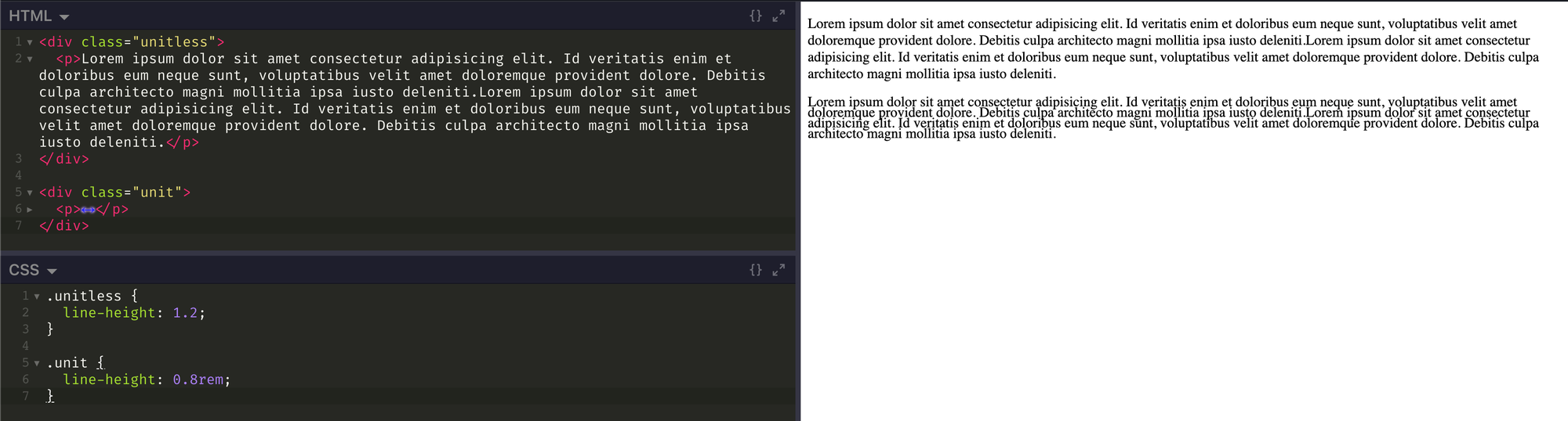
Beware of using units on 'line-height' value
Few CSS properties like z-index, font-weight, line-height support unit-less values. Most of times it's just self-explanatory, you'll know what a value is doing. However, you really need to understand what line-height does when units are used in its value (you'll realise that it's more of a quirk of inheritance).
line-height is an inherited property. It's approximately 1.2 by default and is inherited by all elements on page.
Unit-less value
If an element inherits unit-less line-height value, it's computed as
line-height = unit-less value * font-size
This is very predictable and results in uniform outcome.
Value with unit (absolute or relative)
Whenever you assign values with unit to line-height, they're computed on the element it's declared on and all the child elements simply inherit and use that computed value (in pixels), irrespective of their own font-size.
Accessibility advantage
Have you ever zoomed -out or -in to a web page? It scales all the elements on the page accordingly and many users do that for reading purposes. But it doesn't serve very well as it makes changes only to active tab.
Well, browsers allow users to set a default font size (usually on Settings tab) for themselves. That way, browsers try to resize and adjust the font-size on all pages for the user. However, that's possible only if the font-size is declared with relative units.
Since font-size is really important for reading, esp. for those with impaired vision, declaring font-size in absolute units (like pixels) definitely brings in some accessibility issues.
Tips
- Use rem for font-size, px for borders, em for most other properties (mostly related to box-model).
- Scale up or down the element sizes by setting responsive base font size.
Lulu — But I still don't understand. I'm so used to using pixels. How do I know what values to give when using relative units?
Chrome — Okay, here's the secret - there's no secret. When you started using pixels, you didn't know what to use. You developed it as a habit. Maybe time to change your poor habits to better ones?