
Chrome — Come Lulu, let's do some CSS!
Lulu — Yes. Flexbox today!
Chrome — No, no. Not yet!
Lulu — It's been so long since we started. And we've covered all the basics, too.
Chrome — Not all. You still need to learn about positioning the elements. So we'll do flexbox – but first, let's learn to position.
Lulu — Alright! But next is flexbox.
Chrome — Yes, ma’am. Absolutely!
Positioned and Non-Positioned elements
The CSS property
position decides if an element is positioned or not. position has 5 valid keyword values — static (default or initial), fixed, absolute, relative, sticky.Whenever the
position for an element is not static, it's said to be positioned. Non-positioned, otherwise and by default.Before we take our discussion on positioning any further, there are 2 important concepts that you should understand — rendering process & containing block.
A bit on Rendering Process
After DOM (Document Object Model) and CSSOM (CSS Object Model) are created by browser, both models are merged to create a new tree structure called Render Tree (or Computed Style Tree) which is used to paint all the visible elements on the page to the screen.
Just remember 2 things from the rendering process —
- Elements painted later always appear in front of the elements painted before them.
- Positioned elements are always painted AFTER all non-positioned elements have been painted.
Containing Block
The position and size of any element is controlled by its containing block. By default, containing block for any element is the content area of its nearest block level element. To understand better, consider the markup below —
<div class="container">
	<span>
		<p class="element"></p>
	</span>
</div>
In this case, the containing block for
p.element is div.container and not span even though it's the immediate ancestor. That's because span is an inline element.Whenever you assign to an element –
margin, padding, width or height a value in percentage, it is computed with respect to its containing block (and not the immediate ancestor node).Lulu — Meeoooow. I didn't know that! But wait a second – what has containing block to do with position?
Chrome — Everything. If you change the containing block of an element, that element will be positioned with respect to the new containing block. You'll understand it better as we study different values of
position.Although positioning gives you freedom of placing an element anywhere on the page according to your need, such level of control brings along some responsibility. You must take care that the element —
- doesn't run out of viewport.
- doesn't cover any other elements (if not intended).
Types of Positioning
Let's understand different types of positioning.
Fixed Position
Fixed positioning is activated by applying
position: fixed;. This makes viewport the containing block of the element. That means you can position the element anywhere within the viewport. This is achieved with use of 4 offset properties – top, right, bottom and left. Assigning value to these properties does 2 things —- Position the element.
- Implicitly set the dimensions of the element.
Take a look at the example below. Assigning value to offset properties will position the modal as well as give it a width and a height.
The fixed position is very commonly used to build modals, popovers, et cetera.
Absolute Position
Absolute positioning is activated by applying
position: absolute;. It's very similar to fixed positioning, only difference being – containing block in fixed positioning is viewport and in case of absolute positioning it's the nearest positioned ancestor element.To understand better, let's take a modified version of our first example —
<div class="fixed-container">
  <div class="static-container">
    <span>
      <p class="element"></p>
      <p class="absolute-element"></p>
    </span>
  </div>
</div>
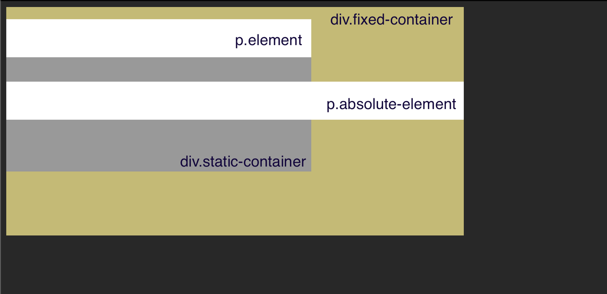
body {
  background: #282828;
}
.fixed-container {
  background: #c4bb77;
  position: fixed;
  width: 600px;
  height: 300px;
}
.static-container {
  background: #999;
  width: 400px;
  height: 200px;
}
.element {
  width: 100%;
  height: 50px;
  background: #fff;
}
.absolute-element {
  position: absolute;
  width: 100%;
  height: 50px;
  background: #fff;
}
You see that?
p.element and p.absolute-element both are sibling elements but width: 100%; doesn't mean same for both. That's because p.absolute-element is an absolutely positioned element and hence, the nearest positioned element will act as containing block for it (irrespective of block level elements in between).Here as well, you can use the offset properties (
top, right, bottom and left) to position an element and it'll also implicitly set its dimensions.The absolute position is very commonly used to build menus, tooltips, et cetera.
Relative Position
Relative positioning is activated by applying
position: relative;. Doing so won't make any difference as such. The element will behave more or less as a non-positioned element. There are 2 key properties of relatively positioned elements —- You can use the offset properties –
top,right,bottomandleftto move the element from its position. That does not affect the nearby elements or their position. Also, doing so will not set dimensions for the element (unlike fixed or absolutely positioned elements).
- Either of vertical offset properties (
top/bottom) and horizontal offset properties (left/right) will work. In which,topandleftproperties override.
Take a look at the pen below. Notice —
- Relatively positioned element behaves same as non-positioned elements.
- Adding offset properties shifts the element from its position without affecting nearby elements. Also,
top&leftoffsets are used on basis of priority (bottomandrightare ignored).
The most common use of relative position is to establish a containing block for absolutely positioned element.
Sticky Position
Sticky positioning is activated by applying
position: sticky;. It's a sweet combination of relative and fixed positioning. MDN describes it as —Sticky positioning is a hybrid of relative and fixed positioning. The element is treated as relative positioned until it crosses a specified threshold, at which point it is treated as fixed positioned.
Similar to relatively positioned element, a sticky element too, will be positioned according to document flow. Element scrolls normally until it reaches a point specified using the offset properties and then sticks there as user continues to scroll.
A simple example below should help you understand.
z-index
At times you need to manipulate the default order of elements, bring an element to front or push back another. This is where the CSS property
z-index comes in. It's an easy-to-use straightforward property but not many developers understand it completely. It works like this —- It can have any integer value. Higher
z-indexelements are placed in front of lowerz-indexelements.
- Negative
z-indexelements appear behindstaticelements.
z-indexworks ONLY ON positioned elements.
- Plays by rules of Stacking Context.
Lulu — Wait, you didn't teach me Stacking Context!
Chrome — Have some patience Lulu. I'm coming to it.
Stacking Context
An element or group of elements (usually it's descendants) that are painted together create a Stacking Context. They're self-contained and can be nested (i.e., a stacking context can contain other stacking contexts).
How it works with z-index
Whenever you apply
z-index to an element, a new stacking context is created with that element as the root. All the descendants of root are painted along with it. To better understand it, consider the pen below —Notice that even though
z-index of div.child-of-first is highest of all, it's not placed in front of div.second. The reason is that it's a descendant of div.first (i.e., belongs to same stacking context) which has lowest z-index.There are more ways in which Stacking Context can be created. Take a look at MDN for that if you're curious.
Lulu — Supercool! Now I know how to catch the birds!
Chrome — What birds?!
Lulu — The ones I told you about last time! Because I cannot float up, I'm gonna position them right at the bottom. Yes!
Chrome — God, Lulu! Come let's go out.