Lulu — Hey! Can you make me float in air?
Chrome — And why do you want to do that, Lulu?
Lulu — So that I can catch all those birds. I don't like it when I'm just about to catch them and they fly away.
Chrome — Well, I think you should just stick to catching the mice. Moreover, floating isn't so much fun. Ask CSS developers and they'll tell you how much trouble it brings!
Lulu — CSS developers can float?
Chrome — Not themselves, Lulu. They float the HTML elements. Ahan! Until we discover how to make you float, why don't you try floating the HTML elements instead? Come, come!
Floats may seem old school now but there are two reasons you may want to study and understand them:
- You might just find them someday in a legacy codebase. God save you, then!
- To date, floats are the only way to make text flow around images.
Lulu — Why do floats have a bad reputation of being troublesome?
Chrome — That's because float was being used for something it wasn't created for. Hence, it posed some challenges in front of developers.
Lulu — What was it created for, then?
The Original Purpose
Floats were introduced in CSS to achieve typical newspaper/magazine layout. The one where text flows around images. And that's it!

How float works?
If you haven't read Chapter 3 yet, it's recommended that you go read that first.
float property has 3 valid values — left, right and none. By default, all elements have a float value of none.As discussed in Chapter 3, float elements are laid out in normal flow, then pulled out and positioned to left or to right based on
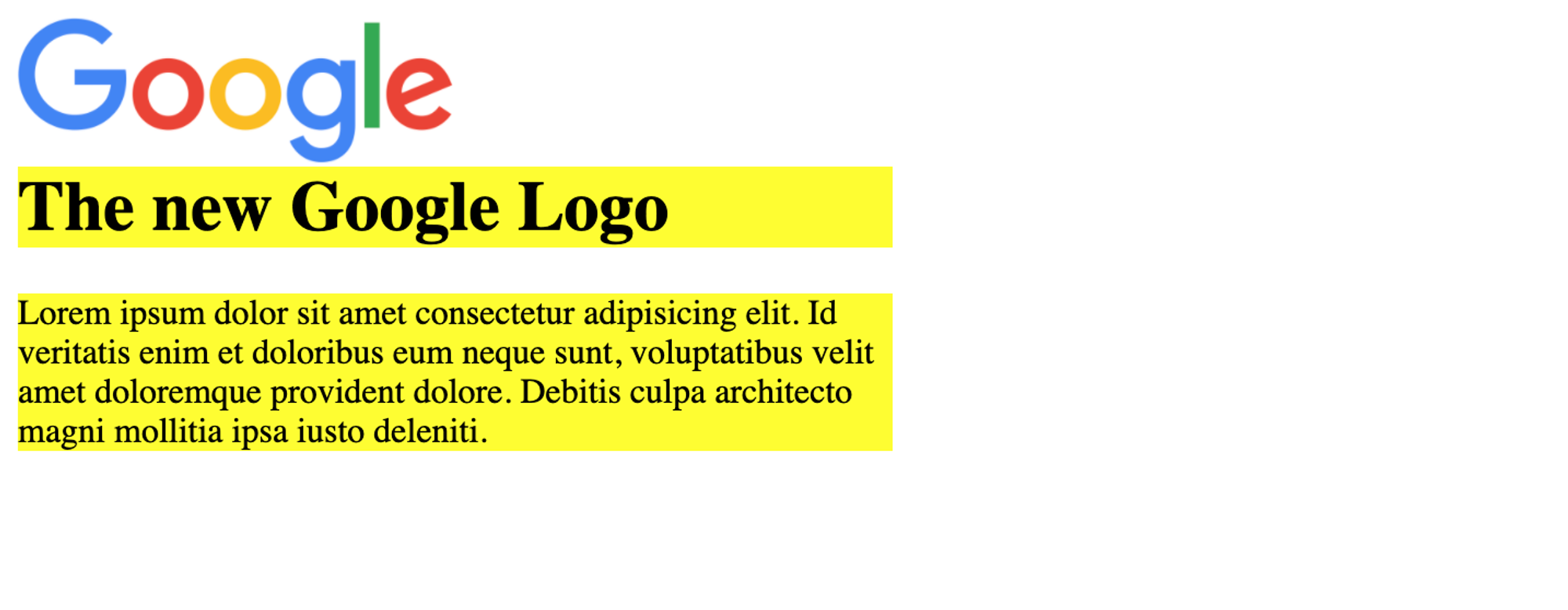
float value. Look at the example below for better understanding.Let's create a newspaper style layout.
<div class="article">
  <img src="https://1000logos.net/wp-content/uploads/2016/11/google-logo.jpg" alt="Google logo">
  <h1>The new Google Logo</h1>
  <p>Lorem ipsum dolor sit amet consectetur adipisicing elit. Id veritatis enim et doloribus eum neque sunt, voluptatibus velit amet doloremque provident dolore. Debitis culpa architecto magni mollitia ipsa iusto deleniti.</p>
</div>
img {
  width: 200px;
  float: left;
}
.article {
  width: 400px;
}

There's something really interesting going on in here. Let's give a background color of yellow to
h1 and p to see that.h1, p { background-color: yellow; }

You see that the
h1 and p are spread full width in the container block without acknowledging the presence of img element. That's because only text (in an element block) flows around floating elements and not the element block itself.Lulu — How can
h1 not see the img? What if I want to make other elements acknowledge the presence of floating elements? ...Only cats can ignore people and things like that!Chrome — Yeah, of course. Now don't start your cat tales! If you want other elements to "see" the floating ones, the
clear property will help you with that!clear - float's best friend
Good for magazine layouts, but floating elements lead to some weird problems, quickly. And so,
float always comes with its best friend - the clear property. The property is used to move other elements below the floating ones that precede them. It applies to both floating and non-floating elements. clear has 6 valid keyword values - none, left, right, both, inline-start and inline-end. By default, clear is none.If you want your element to move below:
- left floating elements, use
clear: left;
- right floating elements, use
clear: right;
- both left and right floating elements, use
clear: both;
- floats on start side of containing block, use
clear: inline-start;
- floats on end side of containing block, use
clear: inline-end;
Let's add
clear to h1 in the logo example to move it below the floating image. Although clear: left; would do but we can fix it for all floats by adding clear: both;.h1 { clear: both; }

Collapsing containers
The biggest trouble when working with floats is "collapsing containers". But if understood properly, they'll never bother you again.
The problem
When a block contains floating elements, it ends up having less height than you'd expect it to have. Sometimes no height at all.
The reason
The height of an element comes from its content (child elements in "document flow"), unless explicitly specified. The floating elements, as you know now, are taken out of the document flow. Hence they do not contribute to the height of their container, irrespective of their own height.
Take a look at the code below.
<div class="float-container">
  <div class="floating"></div>
</div>

<div class="square"></div>
.floating {
  width: 300px;
  height: 200px;
  background-color: rgba(25, 0, 255, 0.4);
  float: left;
}

.square {
  width: 100px;
  height: 100px;
  background-color: #000000;
}
You might expect it to give something like this —

However, it gives this —

That's because floating element's container has no height at all. So our square gets placed at top, behind the floating element.
The solution
There are four ways to fix this. All with their own pros and cons.
- Add a "clear" element as the last child to container block.
<div class="float-container">
  <div class="floating"></div>
  <div class="clear"></div> <!-- add this -->
</div>
.clear {
	clear: both;
}
That's a nice fix. Except that unnecessary markup has been added. Which is definitely not a good practice.
- Make the float container itself float.
.float-container {
	float: left;
}
This fix brings along its own problems. It solves the problem in the sense that it gives the container an appropriate height but now the entire container is floating. So our square will still end up being placed behind the floating elements.
- Add
overflow: hidden;to the float container.
.float-container {
	overflow: hidden;
}
This is a cent percent pure CSS hack.
overflow: hidden; wasn't made to clear floats. Like other fixes, it comes with its own problem. Say you're going to use dropdown or tooltips with float element here, this will hide them if they fall partially or fully outside the container. So beware.- The
clearfixclass hack. This is the most popular fix for collapsing containers. Over the years, developers have written various versions of it. Lets implement one of the most used ones. It makes use of the pseudo elements::beforeand::after. By using pseudo elements, any additional unnecessary markup is avoided.
<div class="float-container clearfix">
	...
</div>
.clearfix::before,
.clearfix::after {
	content: " ";
	display: table; /* this will give a block-level box */
}

.clearfix::after {
	clear: both; /* this clears all floating children */
}
Lulu — Woah! So many hacks!?
Chrome — Yep! Web has come a long way. Before flex and grid, float was the only way to create page layouts and these hacks play a very important role. Now that we've got better ways to do layouts, float-based layouts and grids are called Legacy Layout Methods. You can read about them on MDN.
Lulu — Will you teach me instead?
Chrome — Maybe some other day. Since floats are not used as much now, this lesson is good enough for you to keep going smoothly.
float tips
- Always try to assign
widthto floats. That's very important.
- Remember that a floating element is laid on top of its container.
- Float elements — if all floating on same side — will place themselves wherever they find place. They don't wrap below the preceding elements. Take a look at a 2-column layout achieved using floats and how this thing is fixed.
